Changes in NPS Visits Over Time With D3

This year is the 100th anniversary of the National Park Service and I was curious about how park attendance had changed recently. Andrew Flowers of FiveThirtyEight had a nice overview using official NPS data. The article was interesting but contrary to most of FiveThirtyEight’s pieces there was a stunning lack of interactivity in what I felt was the main figure of the piece

I remade the figure using that same data but just focusong on 2006 until 2015 and basically the popular parks stay popular and vice versa:

Basically, Great Smoky Mountains NP has dominated attendance since its creation but what other parks have recently become popular? I used D3 to make a simple line plot that allowed for interactively exploring park attendance based on year over year change from the mean attendance over the last ten years:

Clearly a spike in recent years - maybe due to lower gas prices or increased popularity of social media?

Also, I was curious about what the trend looked like for the National Monuments.

The most immediate trend that jumps out is the effect of the closing of the Statue of Liberty in 2011 which indirectly caused a slowdown in visits to Castle Clinton.

I aim to visit some new parks and monuments this summer and hopefully looking at the data like this will help me avoid the crowds.
A National Parks Tour With Feather

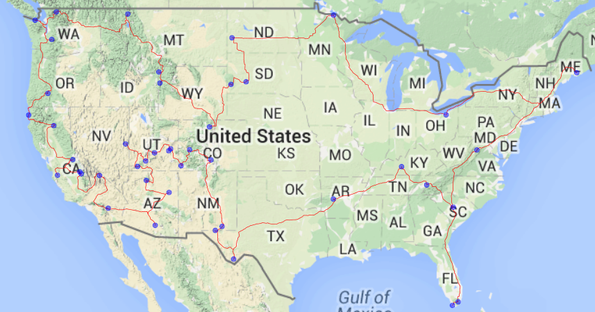
This year is the 100th Anniversary of the National Park system and the National Park Service is kicking things off with National Park Week where every National Park will be open for free. With all the savings, my next thought was what would be the best way to visit all of them in a single trip?

To calculate this, I used a variant of the Concorde algorithm which is an algorithm for solving the Traveling Salesman Problem or what is the shortest route I can use to visit every National Park?

This also gave me an excellent opportunity to use Feather a way of writing dataframes to disk for interchanging between R and Python. I wanted to use R largely due to Michael Hahsler’s TSP library and I wanted to use python because of the ease of use of the Google Maps API client. Finally, I wanted to make a static map to show the route and I decided return to R and use the ggmap library.

I realize there are many ways to call R from Python and vice versa but I wanted to try feather. As a first attempt, I was pretty impressed with feather’s ease of use. I did not have too large of a dataset so I was unable to comment on the speed but simple reading and writing in R and Python is made to feel very simple. The one issue I did run into was more of a user issue and that it was challenging to rapidly flip back and forth between the two languages as I iterated this code. The 0-index of Python versus the 1-index of R is all handled by feather which is nice not to have to think about.

As a whole, I highly recommend checking out feather and as for me, well its time to hit the road and start visiting some National Parks and according to Google Maps I only have 14832.8 miles to go.

My code for this lives here

Super Bowl Sunday at Chuck’s

In the same vein as my previous post on beer sales analysis at Chuck’s Hop Shop, I wanted to make a similar analysis but this time focus on Super Bowl Sunday sales. Similar to last time, I made a few assumptions:

  • A keg is on tap until it is empty.
  • Each keg only serves pints of beer.
  • A pint is the only unit served (ie no 8 oz. pours).

Anyways, here is a brief summary of beers on tap for the shortest amount of time on Sunday:

Brewery Beer Hours on tap
Cloudburst Psycho Hose Beast… 0.25
Iron Fist Mint Chocolate Im… 1.00
Ballast Point Watermelon Dorado… 1.00
Wander Wanderale, Belgia… 1.25
Sound Humonkulous IIIPA 1.25
Cloudburst Saison W/Grapefru… 1.25
Victory Prima Pilsner 1.75
Commons Holden Saison 2.00
Seattle Cider Semi-Sweet Cider 3.00
Deschutes Abyss ‘15 ½ Pint 3.00

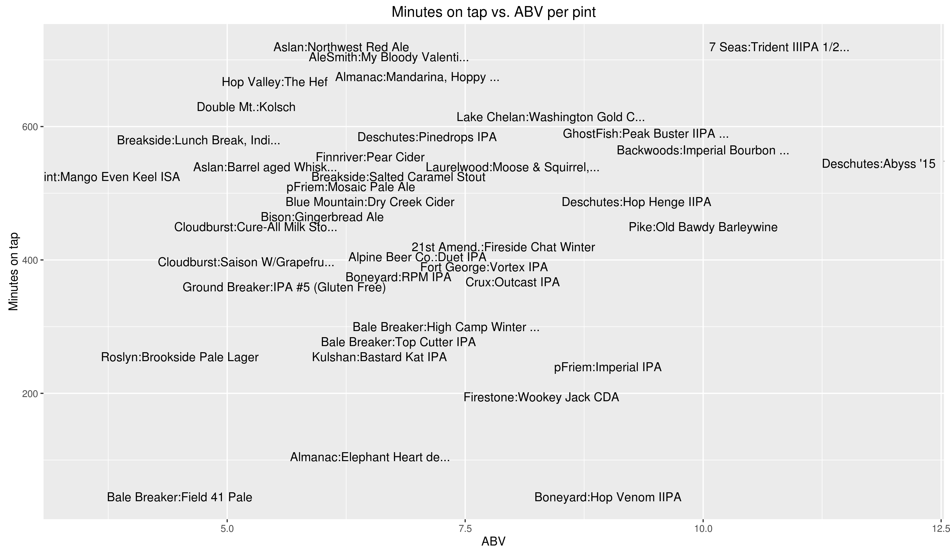
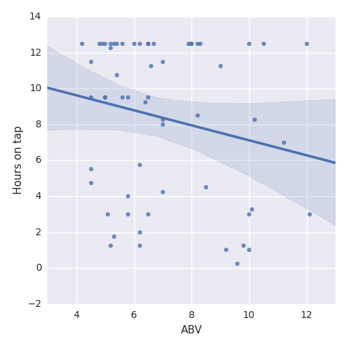
Time on tap vs. ABV

Did beer with higher ABV sell faster?

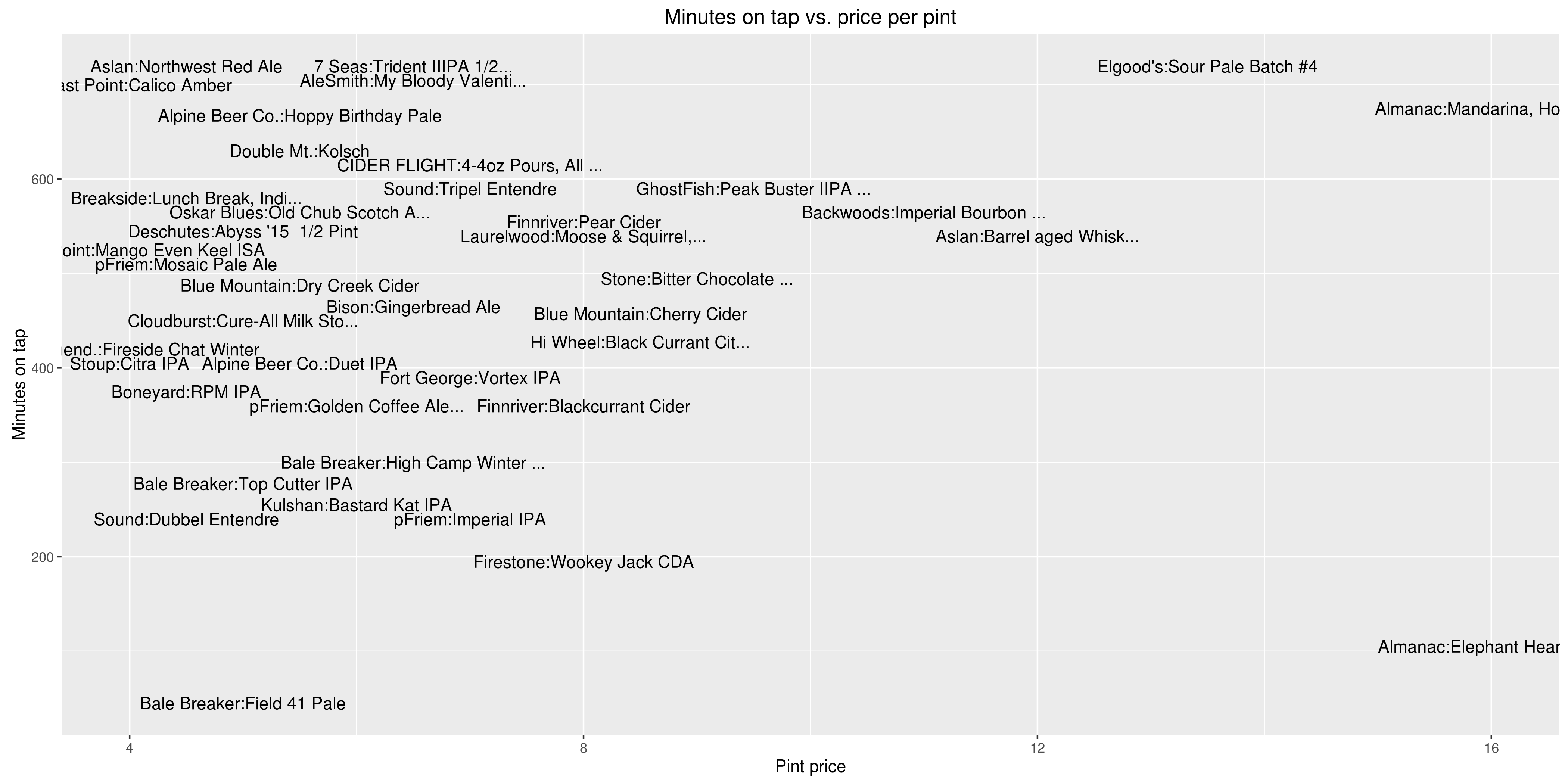
Time on tap vs. cost

Did more expensive beer sell faster?

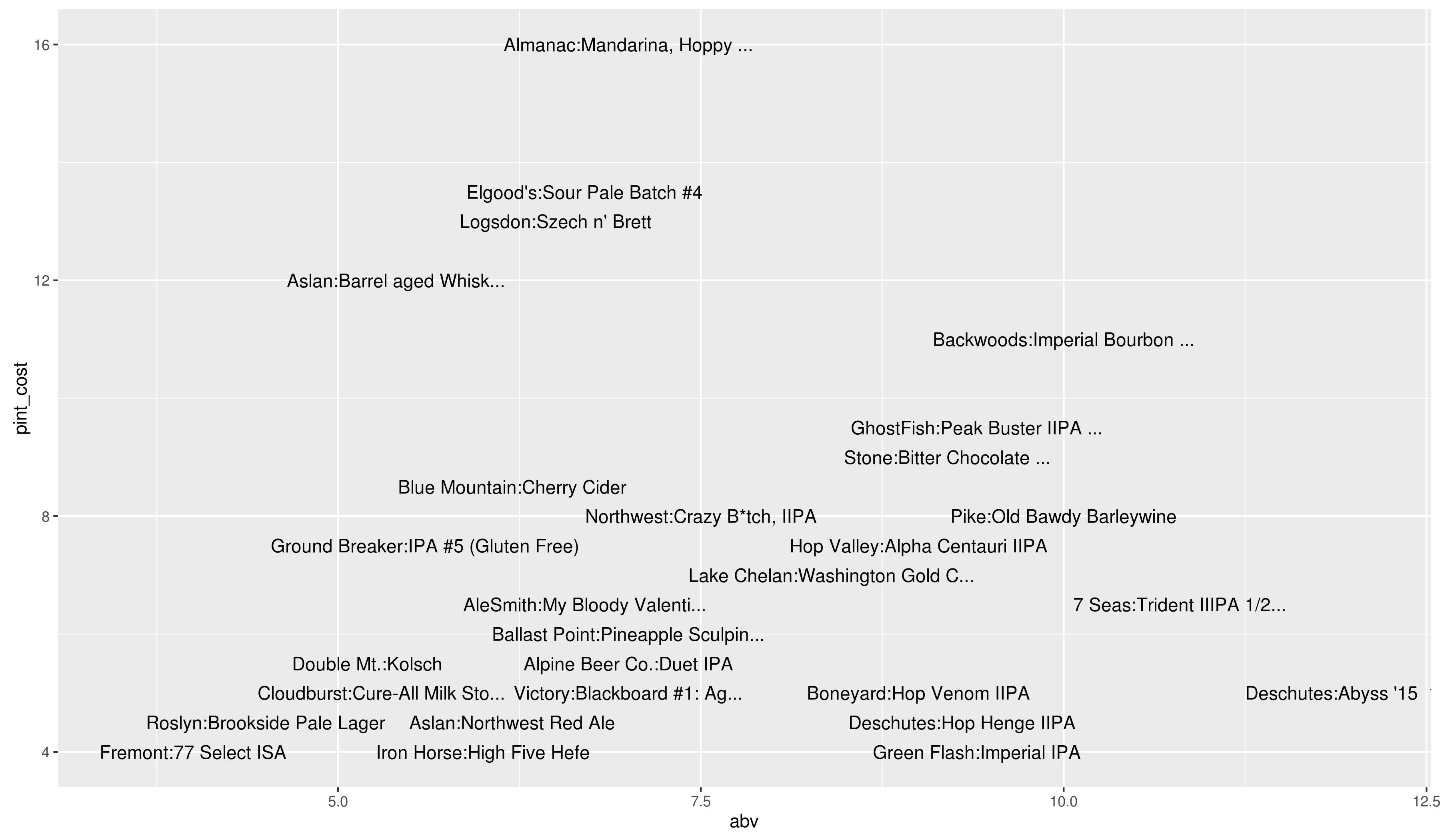
What does the relation between cost per pint and ABV look like?

Once again, all code lives here

Thoughts on Pronto

Pronto bikeshare is in serious financial trouble and may not make it until the end of March of this year. There has been a lot of talk about the future of Pronto and funding but for now I just wanted to mention a few of the things I like about Pronto.

  • It is an excellent great for connecting mass transit and your final destination. Waiting for a bus transfer and then taking said transfer sometimes feels like it takes forever and hopping on a Pronto bike can make the trip dramatically faster.

  • It provides an ideal solution for just going somewhere and not worrying about your bike. Worried about locking up your bike in a certain area at a certain time? If there is a Pronto station nearby that problem can be easily fixed.

  • It is fun, full stop. The bikes are very sturdy and while they can feel a bit slow I never feel like they will have physical problems or break down. Yeah, I realize I look like a dork while riding it but then again I run my own blog, who am I to judge?

  • Finally, cars treat you as if you have never been on a bike before and give you significant leeway. On my commuter bike I often get buzzed by cars but on a Pronto I get treated like some tourist who has no clue what they are doing. From a safety standopint, thats pretty tough to beat.

I think that Pronto had a terrible rollout (starting a bikeshare program in October?) and as multiple people have shown, it does not have the best station placement compared to a similarly sized metropolitan area.

I have had multiple problems with bike docks and the helmet locker can sometimes be unresponsive. But, even after all that, I am long on Pronto and am constantly telling people about it. I had an entry in the Pronto Data Challenge. I was even planning on doing both the Emerald City Bike Ride and Obliteride on a Pronto bike just because I thought it would be fun.

Seattle is growing, really fast in fact, and giving people as many transit options as possible will only make it that much easier for people to move around. I really hope that Pronto lasts longer than the end of March and is eventually able to expand to cover more areas. As to whether the city should step in to save it or not, we’ll leave that exercise to the reader.

Weekend at Chuck’s

Chuck’s Hop Shop on 85th is a beer store with 40 beers on tap and hundreds if not thousands of bottled beers for sale. I have always been curious about what types of beers they go though fastest and what are some of the more popular breweries. Fortunately, they post their current tap list on their website which allowed me to look at their data over the course of the weekend.

I scraped their website every 15 minutes from opening Friday, January 29 - closing Sunday, January 30th. Their website also lists cost per pint, cost per growler, and ABV.

For the purposes of this analysis, I made a few assumptions:

  • A keg is on tap until it is empty.
  • Each keg only serves pints of beer.
  • A pint is the only unit served (ie no 8 oz. pours).

With these assumptions in mind, my first question was which beer goes fastest? The below table shows beers that were on tap for five hours or less:

Brewery Beer Minutes on tap
Bale Breaker Field 41 Pale 74.98333
Boneyard Hop Venom IIPA 74.98333
Almanac Elephant Heart de… 134.98333
Firestone Wookey Jack CDA 224.98333
pFriem Imperial IPA 240.00833
Sound Dubbel Entendre 270.00000
Bale Breaker Top Cutter IPA 277.48333
Kulshan Bastard Kat IPA 284.98333
Roslyn Brookside Pale Lager 284.98333
Breakside Vienna Coffee OG … 299.86667
Bale Breaker High Camp Winter … 300.00833

In a first place tie for a duration of a stunning 1 hour fifteen minutes were Bale Breaker Field 41 Pale and Hop Venom IIPA. There may be another explanation but with respective BeerAdvocate scores of 89 and 97, its easy to see why they are so popular.

Price of a pint vs. ABV

Is there a correlation between the price of a pint of beer and the ABV?

Drinking based on ABV

Do beers with higher ABV get ordered faster?

Are beers at Chuck’s veblen goods?

Do pricier beer move faster?

Obviously there are many more types of analysis one could look at with this data. I do think this analysis was sorely lacking in first person research, something I intend to fix in the next analysis. Full code on github.

2016 Africa Reading Challenge

A blog I occasionally read issues a challenge every year that is simply to read five books from Africa. Since it has been ten years since I moved from Africa back to the States, I figured this would be a good time to finally take on this challenge. I will likely be writing up shor reviews of these on my LibraryThing page. My current list includes:

  • Tram 83 by Fiston Mwanza Mujila (LT page)
  • The Fishermen by Chigozie Obioma (LT page)
  • Waiting for the Barbarians by J.M. Coetzee (Really liked everything I have read by him, not sure why I have never read this one. LT page)
  • Wizard of the Crow by Ngugi wa’Thiong’o (Second book set in a fictional country, perhaps a subtheme for the year? LT page)
  • The Second Coming of Mavala Shikongo by Peter Orner (Okay, not an African writer but it is set where I used to live so I think well worth bending the rules a bit for. LT page

Looking forward to this challenge and you should join in if you feel so inclined.

Summarizing the Seattle Restaurant Scene in 2015

Seattle is experiencing sustained economic growth which manifests itself in a variety of ways, one of the most visible being changes in the restaurant industry. However, tracking the exact changes can be difficult due to a variety of factors such the size of the city and the difficulty in aggregating reliable data. There are several options for attempting to track changes such as scraping data from a review site such as Yelp or Zomato, systematically checking the Food section of the local paper, or going straight to the city records and attempt to determine what restaurant permits are being issued over time.

For the purposes of this analysis, I decided to compare official city permit records with the Food column from a local paper, specifically The Stranger.

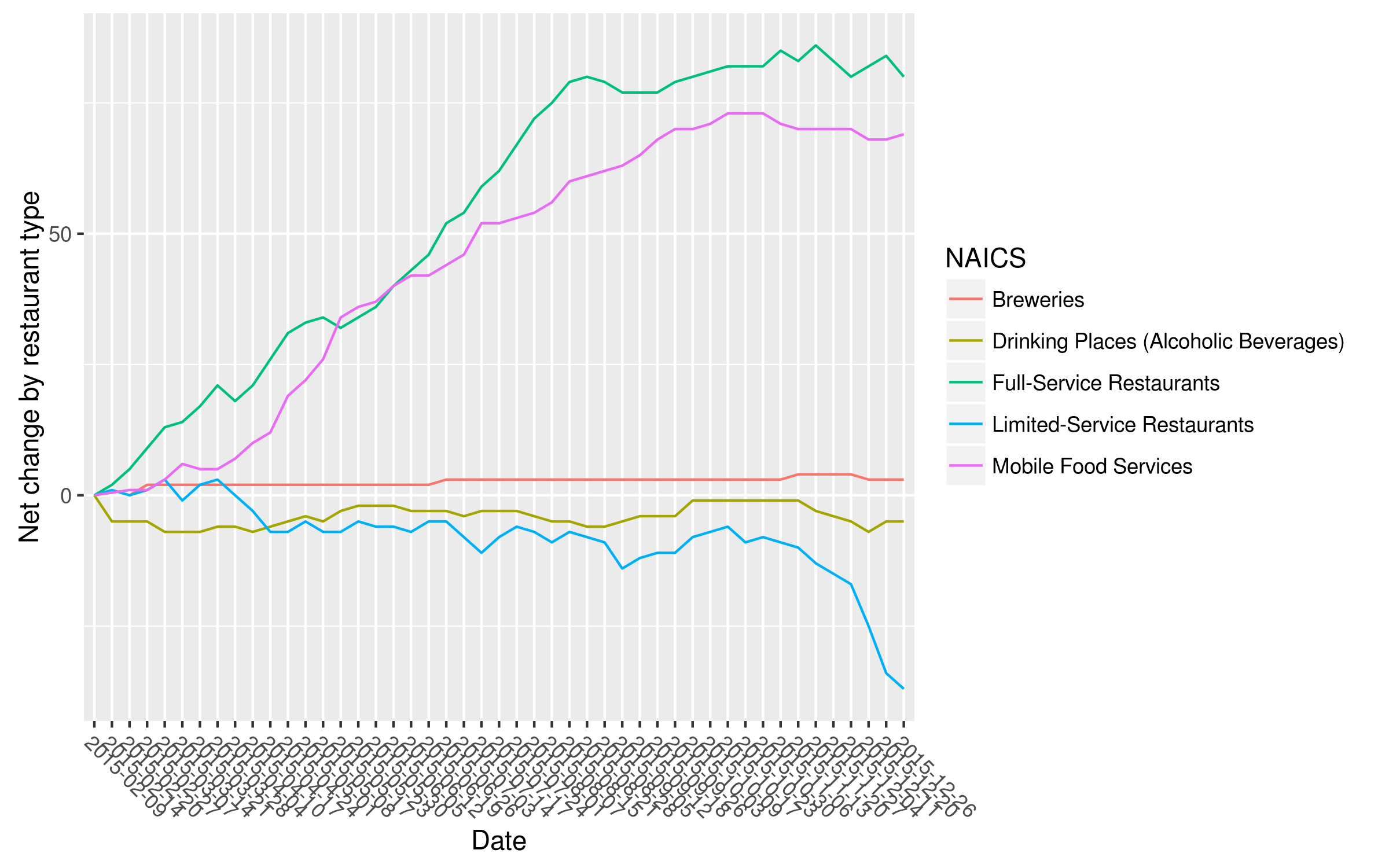
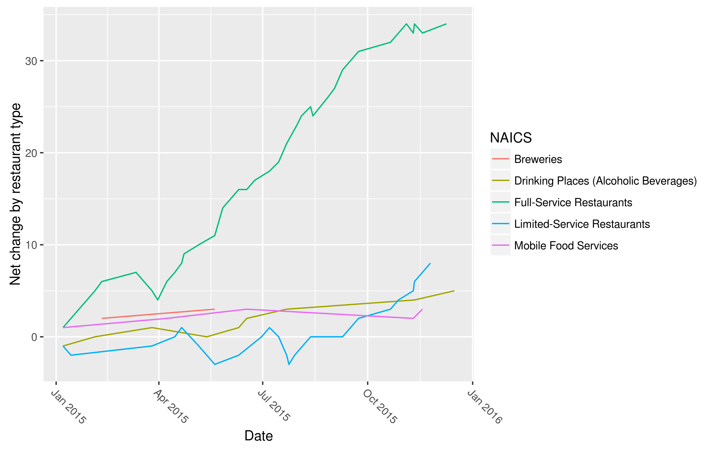
Earlier this year, I started scraping the City of Seattle Business License database which tracks both permit issuance and revocations. The City of Seattle site classifies permits based on NAICS codes. Because I am only interested in restaurant related permits, I focused on the following five NAICS codes: Breweries, Drinking Places (Alcoholic Beverages), Mobile Food Services, Limited-Service Restaurants, and Full-Service Restaurants. I tracked changes in permits by week which when looked at for the entire year produces the following figure:

Clearly a good time to be in the food truck business. Also I am not sure why so many Limited-Service Restaurants are closing and so many Full-Service Restaurants are opening. It could be simply that the restaurant decided to expand its service or attempt to cater to a different clientele. According to the official definition, the NAICS code for Full-Service Restaurant is that “Providing food services to patrons who order and are served while seated and pay after eating”. For more details on these changes, I have made an interactive site that allows you to further investigate by neighborhood and restaurant type.

For comparison, I looked at every column I could find by Angela Garbes who seems to be the main restaurant reporter at The Stranger. I looked at every restaurant opening and closing she mentioned in her column. I then classified all the restaurants she mentioned based on the same NAICS code to generate a similar figure:

Obviously, she has a lot less data and her column is focused on more of the narrative of big name restaurants that have opened and less likely to focus on something like a new Taco Time. She focuses a lot on local food events such as popup restaurants as well as restaurant personnel which is not something that shows up in the official city statistics. Regardless, our figures look very similar and both of the datasets show that Full-Service Restaurants have had sustained growth over the entire year, which makes for great storytelling either with data or a narrative and benefits all of us with increased diversity of restaurant options.

Mapping Seattle Traffic Circles

Recently, there was a post on Priceonomics about traffic circles with the argument that roundabouts are safer, help improve traffic flow, and reduce emissions. The post mentions that there are 3700 roundabouts in the United States, which made me wonder - how many of those are in Seattle?

Fortunately, the City of Seattle data site has GIS data for all streets as well as GIS data for all traffic circles. The traffic circles dataset had 1042 total entries or about a third of the total number of roundabouts in the United States. I’m not sure how accurate that is but I think focusing on traffic circles within the city limits is more interesting.

I used the sp library in R to read in both sets of shapefiles and quickly determine the streets with the highest number of roundabouts:

street count
FREMONT AVE N 27
1ST AVE NW 24
8TH AVE NE 23
DAYTON AVE N 23
6TH AVE NW 21
12TH AVE NE 18

Fremont Ave N. has a whopping 27 traffic circles which seems excessive until you realize that most of these are North of the zoo and not in the denser southern part of the street.

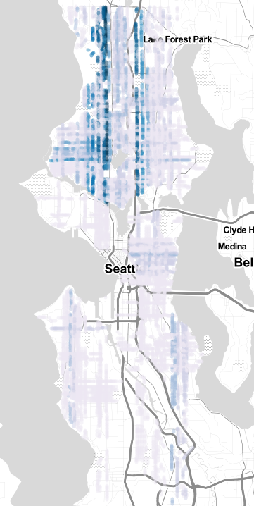
I thought quite a bit about how to best represent these values and ultimately settled on mapping streets colored to the number of traffic circles on that street. I used R and Color Brewer to make a color attribute for the map based on traffic circle count that could be read by Leaflet. I wrote out my GeoJSON files using rgdal::writeOGR() and then found that was way too slow to reasonably run in a browser so I converted it to topojson using topojson -o colored_traffic_circles2.topojson -p color colored_traffic_circles.geojson. Even this ran too slowly so I had to reduce to streets with more than two traffic circles.

Here the darker the color, the more traffic circles present on that street. For me the most interesting feature is how many traffic circles in a N-S direction are right next to State Highway 99 or near I-5. Is this an attempt to mitigate traffic of people trying to use surface streets instead of arterials? Possibly, though difficult to determine. Regardless, 1042 is an impressive amount of traffic circles for a metropolitan area this large.

Notes

  • The City dataset has dates on traffic circle installations with the oldest traffic circle being 18TH AVE E AND E HARRISON ST installed on 1/5/1976
  • Full size version of this map available here
  • All code available here

Subsetting Shapefiles With R

I have been trying to improve my GIS skills lately and have been trying to use R for as much of this process as I can. One of the tasks I frequently perform is taking a shapefile, subsetting it, and then converting to a GeoJSON. The npm module ogr2ogr is excellent for converting from a shapefile to GeoJSON, however I frequntly find myself needing to select only certain areas of a shapefile. I have been using two libraries in R to achieve this, specifically rgdal and sp.

For example, lets use the Congressional District 2012 shapefiles from the Washington State Office of Financial Management. Downloading the file, unzipping, and then loading into R with

We want to select only the districts that cover Seattle, 7 and 9 which is as simple as subsetting

seattle.only <- subset(wa.cd, CD113FP %in% c('07', '09'))

One of the nice features about GitHub gists is that you can overlay a GeoJSON file on a Google map for a quick QC check. While R accepts a variety of projection formats, Github does not and I occasionally I find I have to convert to the WGS84 datum which are easily done with

seattle.only.wgs <- spTransform(seattle.only, CRS("+proj=longlat +ellps=WGS84"))

And written out as a GeoJSON file with

writeOGR(seattle.only.wgs, dsn="seattle.only.wgs.geojson", layer="cd2012", driver="GeoJSON", check_exists = FALSE)

Occasionally I get an error about the file I am about to create not being found. This Stack Overflow answer was very helpful and now I add the check_exists = FALSE parameter every time I write out with writeOGR().

Fremont Bridge Opening Times

I bike across the Fremont Bridge twice a day which Wikipedia claims is the most frequently opened bridge in the United States. This claim is uncited and while it may be true, due to Federal Maritime Law boats get precedence for bridge opening with the exceptions of rush hours which in Seattle are M-F 7-9 AM and 4-6 PM. I often get to the bridge on my bike around 9 AM in the morning and 6 PM in the evening and it always felt like the bridge opens for a boat right at 9 and 6 PM on the dot. I wanted to verify this and figured the only way to do so would be to manually time the bridge openings but that seemed like too much effort.

Recently, a friend notified me about the twitter account of Seattle DOT bridges which is basically a bot that posts bridge openings and closings such as:

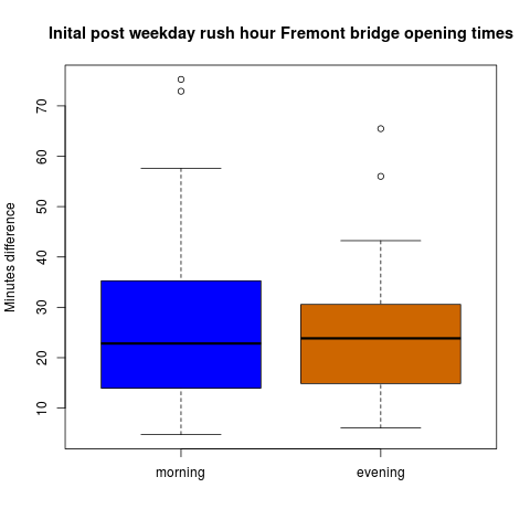
I used the excellent twitteR to scrape tweets from Seattle DOT bridges for the past month to test how accurate my assumption was. From this, I pulled the first crossing post morning rush hour and evening rush hour for weekdays only.

The mean opening time post-morning rush was 9:28 AM and the mean opening time post-evening rush was 6:25 PM which means that my assumptions were pretty off and I should not feel so stressed to arrive at the bridge before 9 AM and before 6 PM.