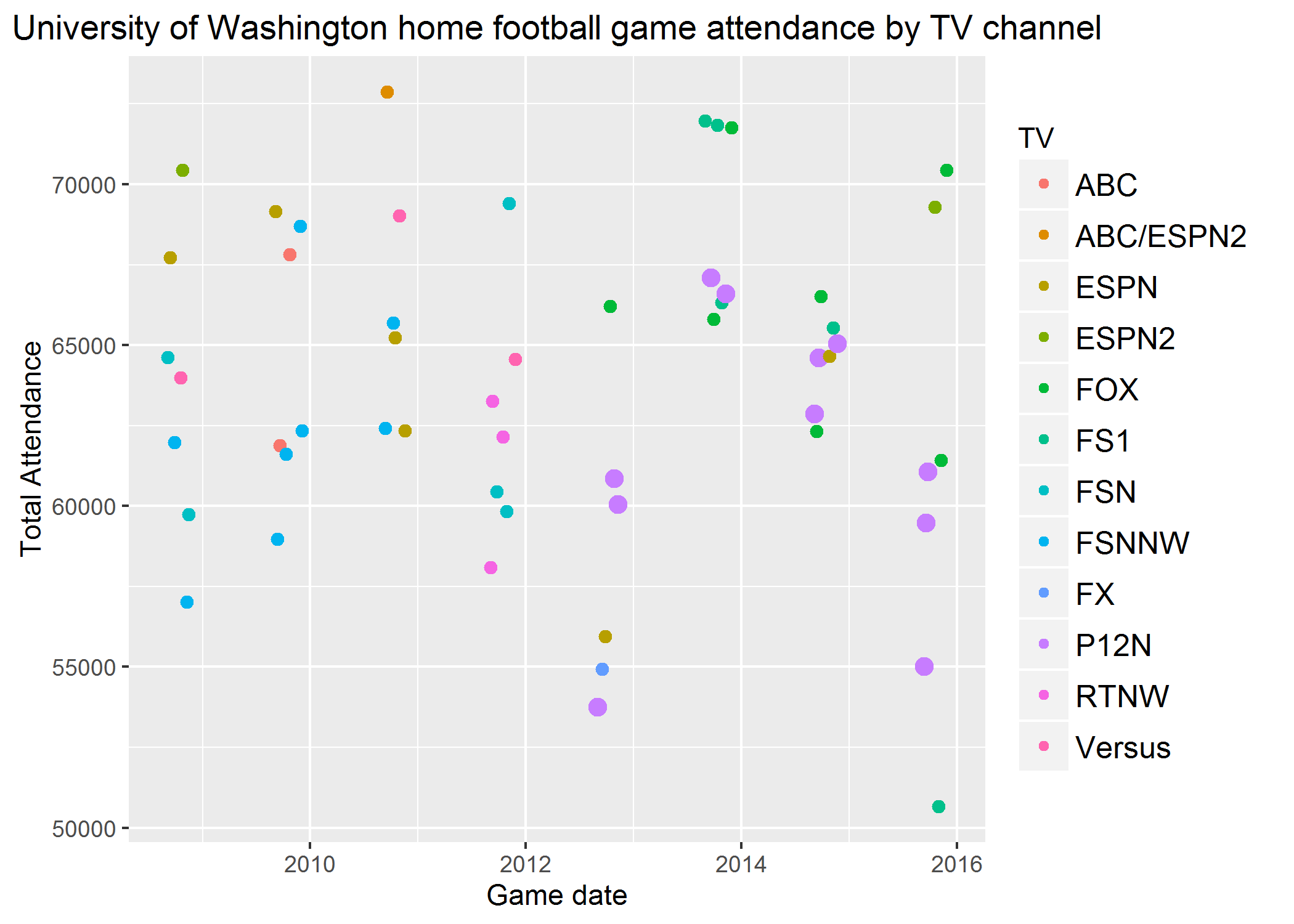
Smarter Binge Watching With Linear Regression

I am not much of a binge watcher but I do enjoy quality TV shows which is why I think GraphTV is so great. GraphTV plots the IMDb user ratings for every episode and then performs a linear regression of the episode rating by the episode number to create a trend line which helps you see if the show gets better or worse over the course of the season.

This is nice but it can get difficult to use GraphTV for shows like Golden Girls and downright impossible for shows like The Simpsons.

To solve this I created a GitHub repo binge-trendy. Because the trend line is fit to the IMDb user rating data, we are interested in which episodes do IMDb users think are better than the regression model predicts which translates to any deviation from the trend line. Since I am only interested in episodes that are rated higher than the regression model would have predicted, I only look at episodes with a positive residual.

For example, Golden Girls season 4

Season Episode Name
4 1 Yes, We Have No Havanas
4 2 The Days and Nights of Sophia Petrillo
4 6 Sophia’s Wedding: Part 1
4 9 Scared Straight
4 11 The Auction
4 14 Love Me Tender
4 15 Valentine’s Day
4 19 Till Death Do We Volley
4 20 High Anxiety
4 22 Sophia’s Choice
4 23 Rites of Spring
4 24 Foreign Exchange

I realize the code is not great, pylint currently gives it a 6.05 but if there is one thing I have learned in software:

Standing Up for Net Neutrality

Currently there are many political issues that demand attention however in my opinion there are none that would affect more people than the possible destruction of net neutrality.

Net neutrality is simply the principle that all data on the internet should be treated the same. It does not matter if you are visiting Fox News or Mother Jones - the data and content from both of these websites (as well as from every other website) should be treated as equal and that data should be served equally by all Internet Service Providers. Losing net neutrality could lead to an internet that favors one of these two sites based on which site is willing to pay more. I chose these sites because they are such polar opposites but at the same time we live in a country that allows for such opposites to have equal protection of freedom of speech. I may disagree with the content of a particular website but I do not think it should be served any differently than the website of a site I do agree with. Destruction of net neutrality will lead to greater influence wielded by larger corporations and could stifle smaller websites and startups.

Fortunately, there is still time to act. On July 12, various online communities and users will come together to stand tall and sound the alarm about the FCC’s attack on net neutrality. Join us here!

Pronto Post-mortem

Pronto bike share ends this Friday March 31st and I will miss it for sure. I wrote about why Pronto mattered to me and I even rode a Pronto bike in the 25 mile Obliteride last year:

In October 2015, there was a Pronto sponsored contest to visualize bikeshare ride data. I created an entry which although did not win, was a nice introduction for me to learn mapping with D3. As I was checking out the Pronto site one last time today I noticed that they had updated their publically available dataset to include 2016 ride data as well as the 2015 ride data.

To me it seems that Pronto had a hard time expanding and encouraging repeat riders. Unfortunately we do not have the membership data but if we can assume that people who did not ride much in 2015 did not renew their membership in 2016 then it looks pretty clear that Pronto was hurting more than people thought. Also, it looked like they had good success in 2015 with getting people to buy day passes especially during peak tourist season in the summer and were able to replicate that success in 2016. I feel there is a need for a dedicated bike share in Seattle however this iteration of bike share does not appear to be the solution we need.

I went back to the Pronto site to fetch all my data because of an idea I worked on then abandoned last summer. The idea was for a website that was basically Strava for Pronto whereby you compared your ride time data to everyone else’s and mapped out how fast you were compared to them. Pronto did not make it easy to download all your trip data so I ended up having to write a webscraper to get out my own data (Hint, hint Pronto 2.0!) which I put at this GitHub repository. I never was able to get my project past the personal level and my ultimate goal was to simply make a map of the route and add in plots. Here is an example of all trips from Fairview Ave N & Ward St to Westlake Ave & 6th Ave:

I’m sad that I can’t work on this project anymore but maybe with Pronto 2.0 I will be able to revist this idea.

Have There Been More Upsets in the NCAA Tournament Recently?

I have been following the NCAA Men’s Basketball Tournament for as long as I can remember and with Selection Sunday coming up, I wondered if there have been more or less upsets in recent tournaments. To look at this visually I used a hypothetical perfect bracket as a reference (i.e. #1 seed beats #16 seed, #2 seed beats #15 seed all the way to #1 seed beating a #2 seed). I took the sum of all the winning seed numbers at each round in the Regional Tournament and used that as the denominator for comparison with the other Regional Tournaments for that particular year.

I went back in time as far as I could but the 2007 Tournament finally harmonized the names of the Regional tournaments with the names East, West, South, and Midwest which made for easier comparison across years.

Clearly there have been quite a lot of upsets in the past ten years especially within the Midwest Region.

I then went back and looked at all games back to 1985 when the Tournament first expanded to 64 teams. For this I did not have all the Regional Tournament information so I just looked at all the games (except the Final Four).

The aggregate data is pretty volatile year over year as well with a low in 2007. If anything, this shows we should be in for another great year of NCAA tournament basketball complete with some (hopefully many) exciting upsets.

A Forgotten Cron Job Leads to Interesting Results

On January 1, 2016 I set up a cron job to perform a daily count of the number of Twitter followers of the two main Gubernatorial candidates in Washington State: Jay Inslee and Bill Bryant. I was not attempting to predict the election or do anything with the data, I just wanted to count followers until Election Day 2016 and hopefully plot some interesting results. I checked on Election Day and the trend lines remained pretty much the same as they did at the start of the year so I abandonded my idea. Today I was cleaning out my crontab file and I found that the cron job was still running. I added a solid line for the 2016 Election Day and dashed line for the 2017 Presidential Inauguration.

To me, the follower count data after the inauguration is the most interesting but it is just count data and I am not sure how much you can really read into it. If anything, forgetting the cron job was a pleasant surprise that reminded me of this guy who took a screenshot of the New York Times frontpage everyday for 5 years YouTube.

First Book of the Year

Last year I started off the year by making Ashlee Vance’s biography of Elon Musk the first book I read all year. I wanted to start 2016 off better than 2015 and thought this book might help my thinking. The story is on Musk is quite interesting if anything to simply show how much he believes in himself even when the odds seem stacked against him and the money in the bank grows lower. I tried to use Musk’s story to improve my own self-confidence and I felt like the most concrete way I was able to do so was to reduce the amount I took on and instead focus on doing a better job of what I had in front of me.

I will be repeating this little project in 2017 by starting the year off by reading Spread Spectrum:Hedy Lamarr and the mobile phone by Rob Walters. I know very little about spread spectrum technology and Hedy Lamarr had a very interesting life and is greatly underappreciated in modern society. Hopefully this book will prove to be as motivational over the course of the year in a similar manner as Musk’s biography was.

Election 2016

It has now been a month since the 2016 US Presidential election and I am still stunned by the outcome but am ready to move on.

The major issues I focused on while voting at the Presidential level were a better climate policy and more equal treatment for minorities and other marginalized populations. When I stop and think about why these were the major issues for me, I realize that I am pretty fortunate. I have a great job, generally feel safe, and am optimistic overall about the future and the economy.

The biggest realization for me was that although I care deeply about these issues on a national level, I need to be more involved at the community level.

After thinking about it, there are three ways I want to get more politically involved:

  1. Increase the amount of money I donate to specific organizations on a recurring basis.

  2. Get more involved with organizations that focus on climate advocacy and immigrant populations. I did do some volunteer work with CarbonWA and I want to get more involved with them as well as with an organization that focuses on immigrants such as ReWA

  3. Write more letters to elected officials about the issues I am most passionate about. I have helped make a github repo of all the boundaries of my hometown and I have never used this for any reason other than looking up addresses. At least I know where to look to figure out the various districts I live in.

Will these actions by me make a difference on the national level? Not likely but hard to say. What they will do for sure is to make an impact at the local level and will help me to improve the community around me. If these issues are important enough for me to write this post about, then it goes to show that they are important enough for me to get more involved with.

Has the Pac-12 Network Decreased UW Home Football Game Attendance?

The University of Washington Husky football team is taking on Rutgers this Saturday with kickoff at 11 AM PST. This is awfully early to start a game, especially a game that occurs during Labor Day weekend. The game is being aired on the Pac-12 Network which is about to enter its fifth year of operation. This made me wonder, with the presence of the Pac-12 Network, has attendance decreased at home UW football games?

Fortunately, Wikipedia lists game attendance which allows for a quick overview of UW home games stratified by network:

The purple dots are UW home games shown on the Pac-12 network, not entirely convincing but at first glance they don’t look too great for the network. I then looked at only home Pac-10/Pac-12 games and looked at attendance by season:

That high point in this figure is UW versus Oregon in 2013 while that particularly low point in 2015 was versus Arizona on Halloween which happened to fall on a Thursday in 2015. Why some executive at FS1 thought it would be a good idea to schedule a game then is beyond me.

In 2012, UW played its home games at CenturyLink Field, while Husky Stadium was renovated. For the 2013 season the UW football team returned to play at a smaller Husky Stadium, did either of these factors impact attendance?

Not really, there is a minimal difference in stadium size which is reflected in this identical-looking figure.

What Pac-12 opponents were the biggest draws on average?

Opponent Average Attendance
Oregon 69584
Washington State 68862
Colorado 64373
USC 64046
Oregon State 63777
Stanford 63360
UCLA 62544
California 62541
Arizona 60756

Obviously there are a lot of factors that can’t be captured by game attendance alone but with a significant budget deficit largely blamed on reduced attendance, it seems like it might be time for the UW to analyze if the Pac-12 Network has really been worth the investments to date.

Full code for scraping Wikipedia on GitHub

This American Life Stats

Lately I have been listening to episodes of This American Life faster than they are making them which means I have been going back to the archive for past unheard shows. Their website has a nice user section where you can log in and mark episodes you have heard and your favorites. The archives are arranged by year which naturally got me thinking about the number episodes I have listened to by year. A search of GitHub revealed many libraries for downloading episodes of the podcast but none that were interested in user statistics so I decided to write my own library. I am still very much beginner level with technologies such as passing cookies and CSRF requests which is why I ultimately ended up using Splinter which just lets you automate browser actions. I used that to login and navigate the TAL archives by year. I then used BeautifulSoup to parse the HTML. Finally, I just wanted to visualize the results so I used Mike Bostock’s D3 Bar Chart example.

Pretty basic but it gets the job done, full code here on GitHub

Slopeplots of African GDP With Ggplot2

I finally got around to reading Poor Numbers by Morton Jerven and found it really interesting. Basically Jerven argues that academic literature has either “neglected the issue of data quality and therefore accepted the data at face value or dismissed the data as unreliable and therefore irrelevant” and this causes many issues with the more data-driven approach to international aid in recent years.

The key table in this book was (in my opinion) a largely inscrutable table that showed African economies ranked by per capita GDP with data from three different sources of national income data: the World Development Indicators, Angus Maddison, and Penn World Tables. The differences in the rankings is hard to parse in a table but would theoretically lend themselves well to a slopegraph originally proposed by Edward Tufte in The Visual Display of Quantitative Information

Although not a true slopeplot, I was able to use a combination of geom_line from ggplot2 and the directlabels package to generate the following plot (which I will admit is a bit of a hack):

I was mainly interested in observing the variation in the top ten or so countries which this plot handles well. The remaining 35 or so countries are difficult to tell apart mostly due to very large differences in GDP. A log transformed plot shows that there is generally more consistency within the different rating agencies but some variation between them.

Slopegraphs are an effective and efficient way to visualize this type of data which is odd because I feel like they are rarely used and only barely mentioned in Tufte’s works. Hopefully more people being exposed to them will result in further usage.

Data from Table 1.1 from Poor Numbers and full code available at this gist