Slopeplots of African GDP With Ggplot2
I finally got around to reading Poor Numbers by Morton Jerven and found it really interesting. Basically Jerven argues that academic literature has either “neglected the issue of data quality and therefore accepted the data at face value or dismissed the data as unreliable and therefore irrelevant” and this causes many issues with the more data-driven approach to international aid in recent years.
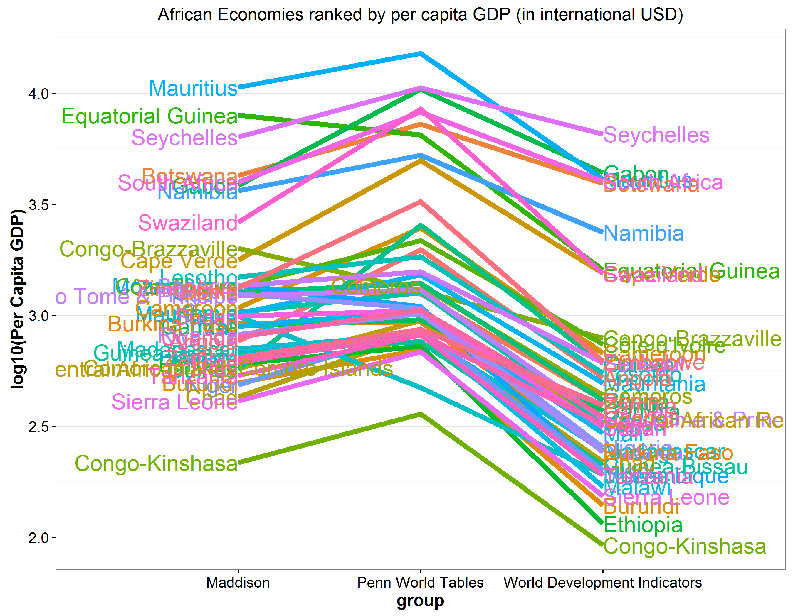
The key table in this book was (in my opinion) a largely inscrutable table that showed African economies ranked by per capita GDP with data from three different sources of national income data: the World Development Indicators, Angus Maddison, and Penn World Tables. The differences in the rankings is hard to parse in a table but would theoretically lend themselves well to a slopegraph originally proposed by Edward Tufte in The Visual Display of Quantitative Information
Although not a true slopeplot, I was able to use a combination of
geom_line from ggplot2 and the
directlabels
package to
generate the following plot (which I will admit is a bit of a hack):
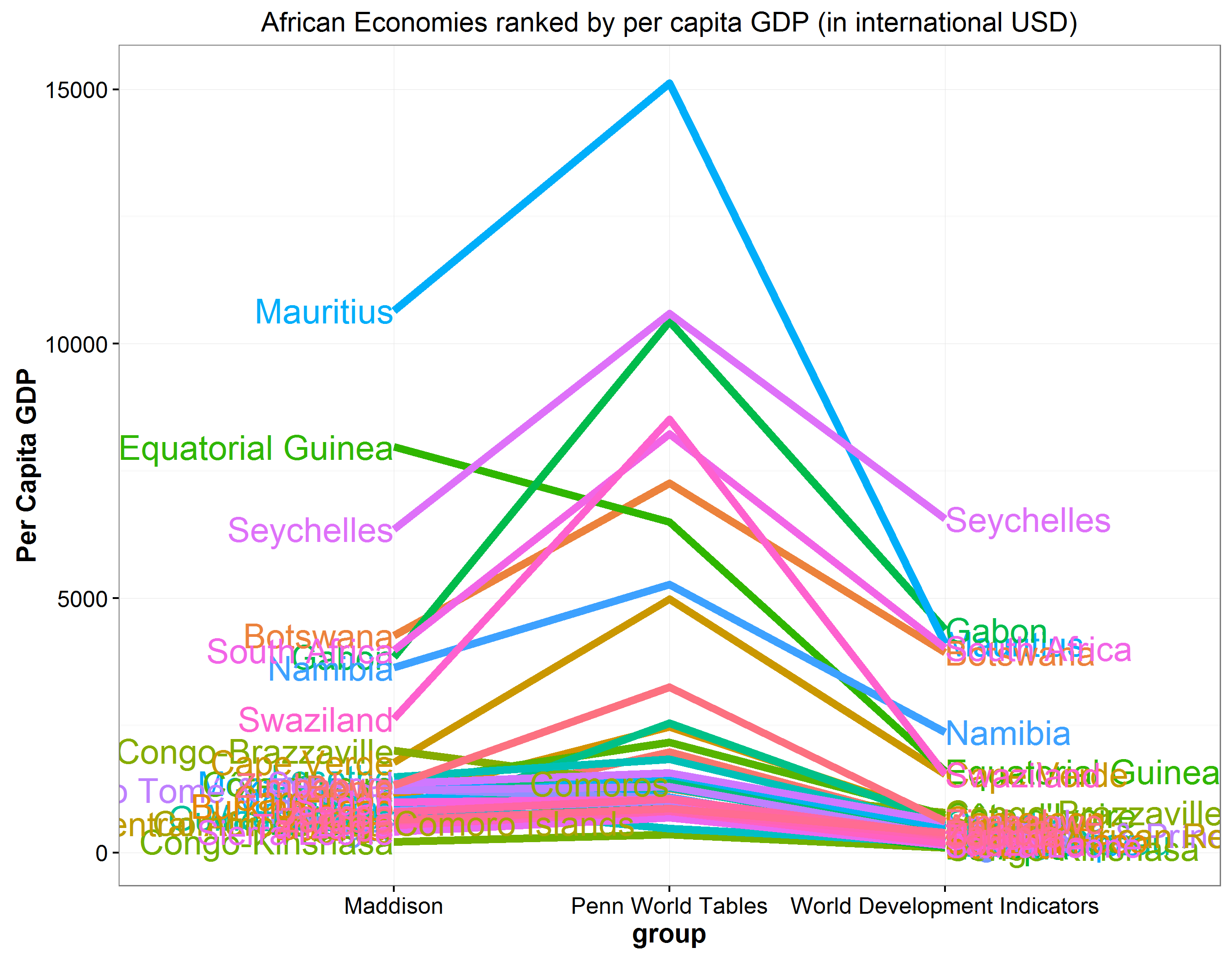
I was mainly interested in observing the variation in the top ten or so countries which this plot handles well. The remaining 35 or so countries are difficult to tell apart mostly due to very large differences in GDP. A log transformed plot shows that there is generally more consistency within the different rating agencies but some variation between them.
Slopegraphs are an effective and efficient way to visualize this type of data which is odd because I feel like they are rarely used and only barely mentioned in Tufte’s works. Hopefully more people being exposed to them will result in further usage.
Data from Table 1.1 from Poor Numbers and full code available at this gist