Visualizing Flight Data for the 2017 Seattle Mariners
Remember this map that Facebook created of friend connections back in 2011?
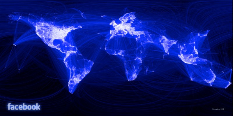
I thought it was pretty cool back then and I still think its pretty cool. I wanted to make a similar map but was not sure where to start. I could have done a similar visualization however I recently quit Facebook so I can no longer export all my friend’s data to use for making maps. My next thought was visualizing travel routes such as flight information. I am trying to reduce my carbon footprint which meant I only flew five times in 2017 and have flown exactly zero times so far in 2018. Then I thought, you know who does fly alot? The Seattle Mariners.
First step was to collect all the Mariners game data, fortunately Baseball Reference has all that data in an easily accessible HTML table.
Next step was to geolocate all the stadiums which can be a bit tedious. Fortunately GitHub user the55 created a nice JSON file of all the stadiums and put it as a gist. I was able to use an R library called geosphere for using the Haversine formula to calculate the distance between two stadiums.
My initial attempt here:

In order to make the image look similar to the Facebook connection map, I ended up using this Flowing Data post quite a bit to figure out how to add the lines and change the background color:

Finally because there were so many trips from Seattle to American League West opponents that I ended up adding a bit of noise or jitter to the stadium locations to make the flight paths not perfectly overlap each other.

Looking back at this 2017 reminded me the Mariners finished 78-84 in 2017, here’s hoping to a better season in 2018!
If interested, I put all the code for this analysis here